Rosca Pouch Packaging Design
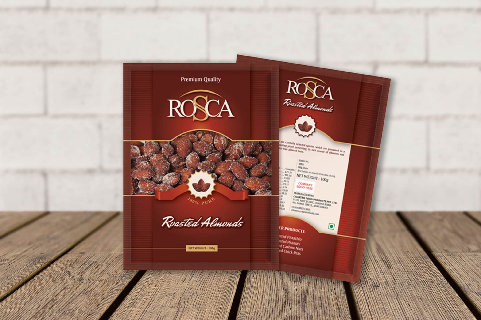
Pouch Packaging Design for Rosca – A roasted Almond Selling Company
Rosca – A great example of simple, clear yet highly distinctive pouch packaging design.
Clarity and Simplicity was core belief while creating Rosca – pouch packaging design. Also, it clearly clarifies that product is for Roasted Almonds through sufficient transparent window area. Therefore, Simplicity in lay-outing and usage of colors doesn’t confuse user. As well as, it is pretty clearly gives message to sub-conscious mind that it is food color.
Ribbons and images with unique typography gives it an edge of modernity too. Usage of white color on back side justifies the technical information to stand out properly. It doesn’t confuses user to by mistake even.
Another option with slightly brighter orange is definitely a different feel. Changes in the actual product display area is major benefit. It shows real product of Roasted Almonds with honesty. Small background patterns and white area clearly pops out brand name “Rosca”. Thoroughly different style makes unique backside of the pouch packaging design.


